
Design / Less, but intentional
What makes a premium landing page feel expensive
The details that give a digital experience confidence: spacing, typography, hierarchy, rhythm and restraint.
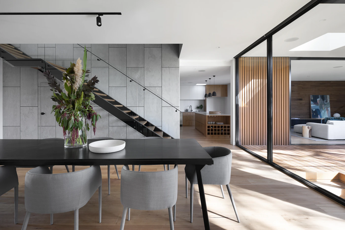
Premium design is less about adding expensive-looking effects and more about making every choice feel considered. A restrained color palette, thoughtful photography and consistent typography create confidence before anyone reads the details.
Begin with visual hierarchy. The first screen should communicate what the company does and why it matters. One great headline almost always performs better than several competing claims. Use generous space to separate ideas instead of relying on borders around everything.
Typography gives the page a voice. Choose a small type scale with confident contrast between major headings and supporting copy. Keep paragraph widths comfortable and pay attention to line height.
Finally, review motion and interaction. Animation should explain, not distract. Buttons must be recognizable, navigation predictable, and imagery fast to load. A premium website feels composed because every decision serves the visitor.
Sitevo Journal · Ideas worth building on.
Explore more stories →